DECEMBER 17, 2016
TAGS
Hie,
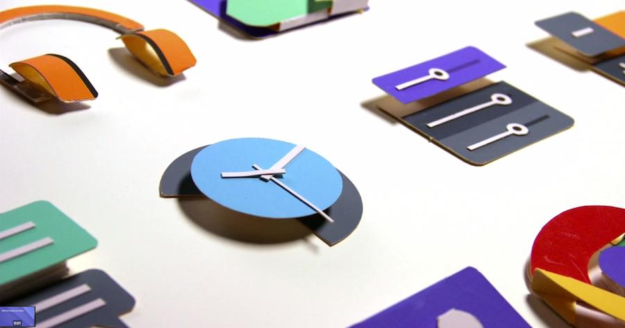
I love Material Design. It is the design language developed by Google which is based on principles of paper. The theme is flat, but real enough to visualize the depth.
There are couple of libraries which can be used to make Material Style Web Pages. Google has it’s own Material Design Lite library. But I personally like Materialize CSS, for no specific reason.
The only thing missing in these libraries is Animations. The animations in Material Design are more life-like. They start slow, speed up and decelerate gradually. The animation which I like the most is the Ripple Transition. Following are some examples:

So, lets start making this using CSS and JS!
If you look closely, the animation starts by circle popping at the point of touch. Then the circle expands and fills the whole container.
We will simulate the same. First we will define a container, with some bounds. Lets call it expandable-container.
<div class="expandable-container"></div>Let’s define CSS for the expandable-container
.expandable-container {
	position: relative;
	width: 400px;
	height: 200px;
	border-radius: 1px;
}
I have kept the position: relative which I’ll expain later.
Now, lets define the CSS for the circle which will pop out. We’ll call it expandable
.expandable {
	display: inline-block;
	position: absolute;
	vertical-align: middle;
	width: 50px;
	height: 50px;
	border-radius: 50px;
	-webkit-transition: transform .4s ease-in-out;
	     -o-transition: transform .4s ease-in-out;
	        transition: transform .4s ease-in-out;
	background-color: #fff;
}
Now, using JS, we’ll dynamically add a circle and expand it. Lets define a JS method to do this.
function expand_handler(event){
	expandable_container = (document.getElementsByClassName('expandable-container'))[0];
	expandable_container.body.innerHTML += '<div class="expandable"></div>';
	expandable_container.style.overflow = 'hidden';
	expandable = (expandable_container.getElementsByClassName('expandable'))[0];
	var x = event.clientX;
	var y = event.clientY;
	x -= expandable.parentElement.offsetLeft;
	y -= expandable.parentElement.offsetTop;
	expandable.style.top = y-25+'px';
	expandable.style.left = x-25+'px';
	expandable.style.transform = 'scale(50)';
	setTimeout(function(){
		expandable_container.style.backgroundColor = '#fff'
		expandable_container.style.boxShadow = '0 1px 3px rgba(0,0,0,0.12),0 1px 2px rgba(0,0,0,0.24)';
		expandable.style.zIndex = -1;
	}, 500);
};
Let us understand what’s happening.
First we added the circle to the container.
expandable_container.body.innerHTML += '<div class="expandable"></div>';
Then we applied overflow: hidden property to the container. Because, we want the circle to fill the container and not to cover it.
Then we set the position of circle where the mouse click happened. event.clientX and event.clientY will give the coordinates of click event.
Remember, we had kept position: relative for expandable-container, the reason is, we want the position of circle w.r.t. the expandable container. The quick hack to do this is to keep position: relative for parent element and to keep position: absolute for child.
But there’s more to positioning, the positioning is done w.r.t. top left corner of the screen, but we are doing it w.r.t. top left corner of container. The coordinates we get from the click event are w.r.t. screen. To convert them w.r.t. container, we’ll subtract the left and top margins of the container.
x -= expandable.parentElement.offsetLeft;
y -= expandable.parentElement.offsetTop;
Now we’ll apply the coordinates to circle using CSS top and left property. We’ll subtract 25 from each values because the circle is 50x50px, so we’ll have the center of circle on click position.
expandable.style.top = y-25+'px';
expandable.style.left = x-25+'px';
Now the real part, expanding the circle. Using CSS transform scale() method, we’ll expand the circle to fill the container.
expandable.style.transform = 'scale(50)';
That’s it, the animation is complete!
There is some post-processing done after the animation is complete, like changing background color of container same as circle, removing circle out of view, etc.
So, how to close the container. Pretty easy, just follow the steps for opening in reverse order. Following code snippet illustrates it:
function close(){
	expandable_container = (document.getElementsByClassName('expandable-container'))[0];
	expandable = (expandable_container.getElementsByClassName('expandable'))[0];
	expandable_container.style.backgroundColor = '';
	expandable_container.style.boxShadow = '';
	expandable.style.zIndex = 20;
	expandable.style.transform = 'scale(1)';
	setTimeout(function(){
		expandable_container.removeChild(expandable_container);
	}, 500);
};
That’s it, we’re done here!